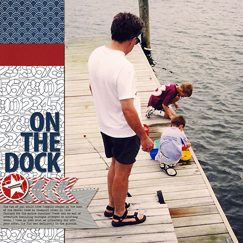
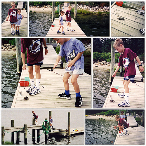
This month, I did a fair amount of scrapping with the Red, White and Blue color scheme, including a layout for the Simple Scrapper’s July challenge Design Team article, which I’ll share next week.
My two-page layout using templates from the July Simple Scrapper release documents time spent on Martha’s Vineyard in the late 1990’s. These photos were taken with a film camera and scanned for the digital layout. The release includes grid templates that can easily be paired with focal photo templates, as I’ve done here. I think it’s evident that my sons enjoyed the countless hours they spent on the dock of the home we rented in MV.


Digital Supplies: Template from Simple Scrapper Premium Membership; Audacious Designs Currently papers; Agnes Biro En Route element (fish); Crystal Wilkerson element (star sticker); Katie Pertiet papers (red, navy) and element (staple); Robyn Meierotto paper (woodgrain)

Love the website Jean as well as the these layouts! Looking forward to reading your blog. Cheers, Jess
Another great layout, Jean. It most definitely looks like your sons enjoyed this vacation – great photos and memories.