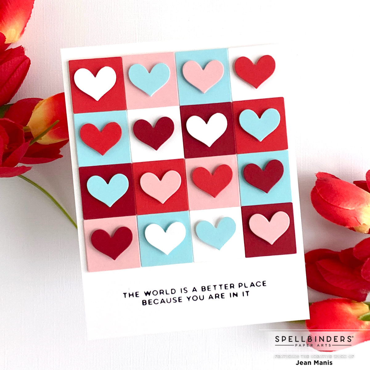
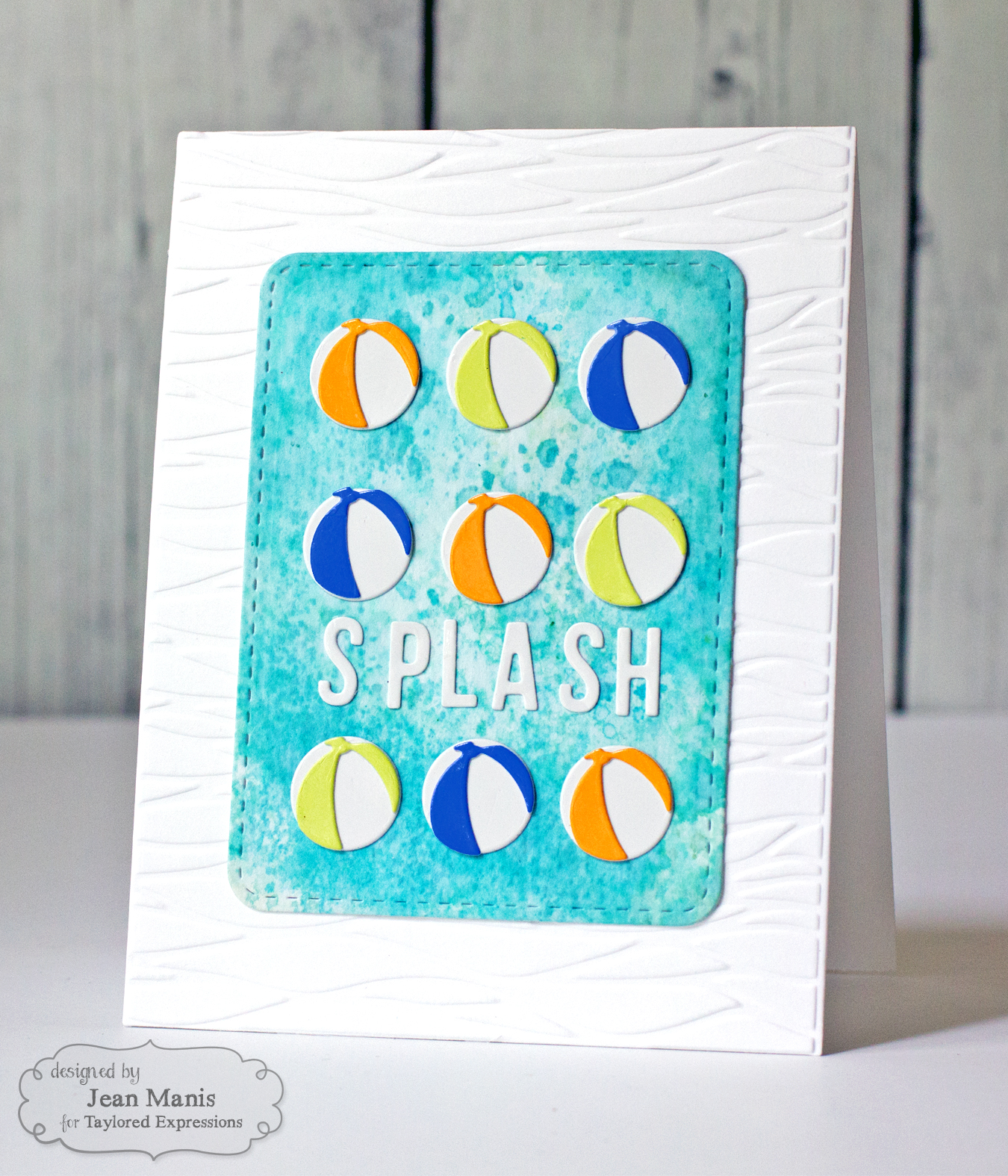
Hello! After recently posting this card, I began to reflect on how often I use repetition in card design. Repetition is a powerful design principle that enhances handmade cards by creating visual harmony, emphasizing focal points, and simplifying the design process. Let’s take a look at cards from my blog archive as examples. Click on the card image to be taken to the original post.
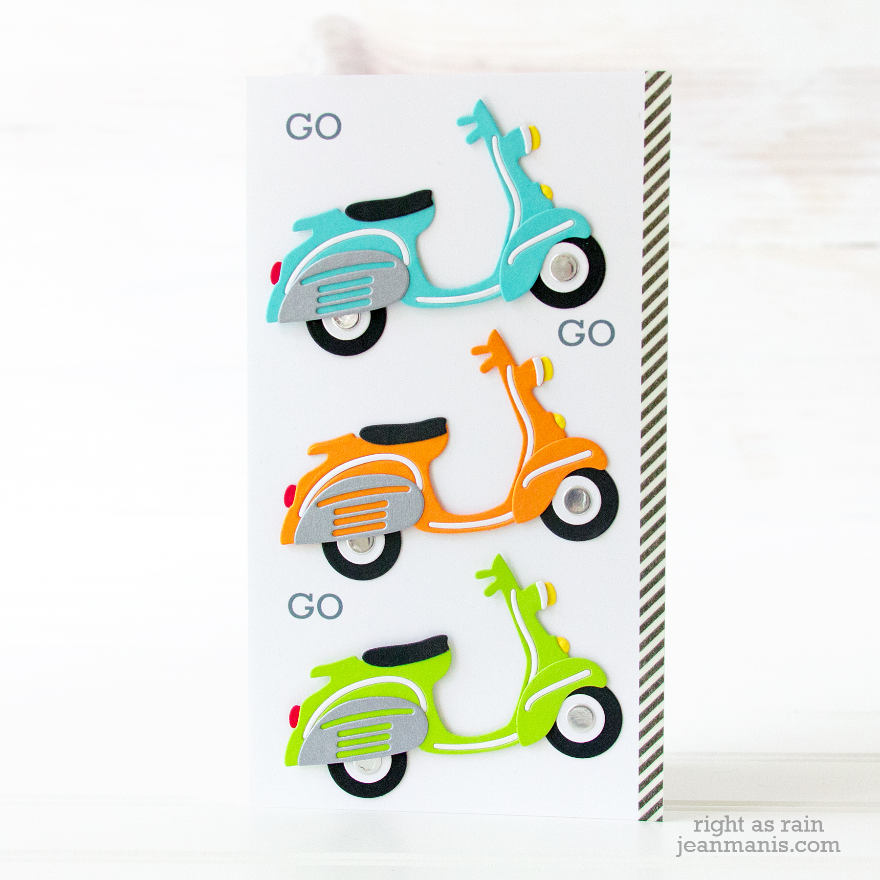
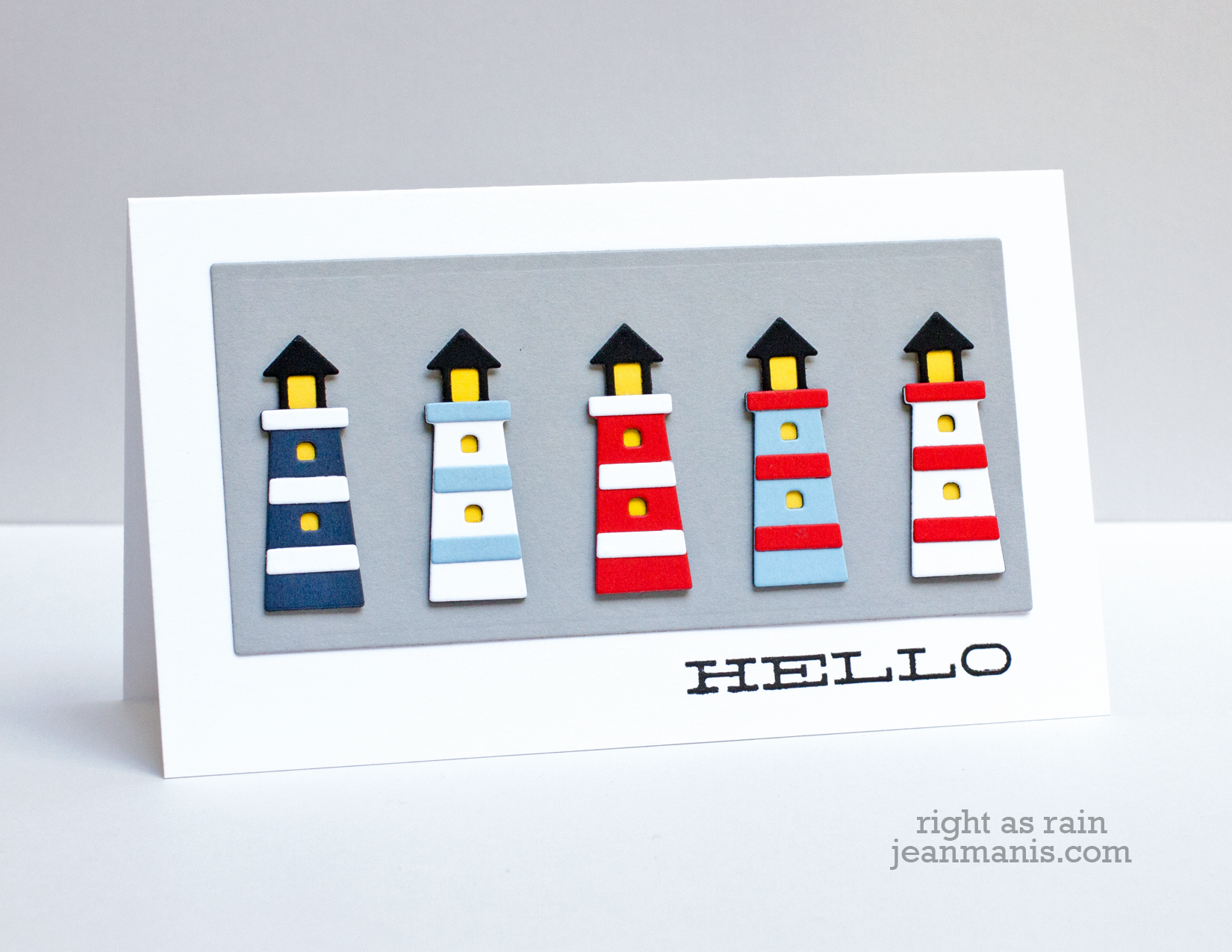
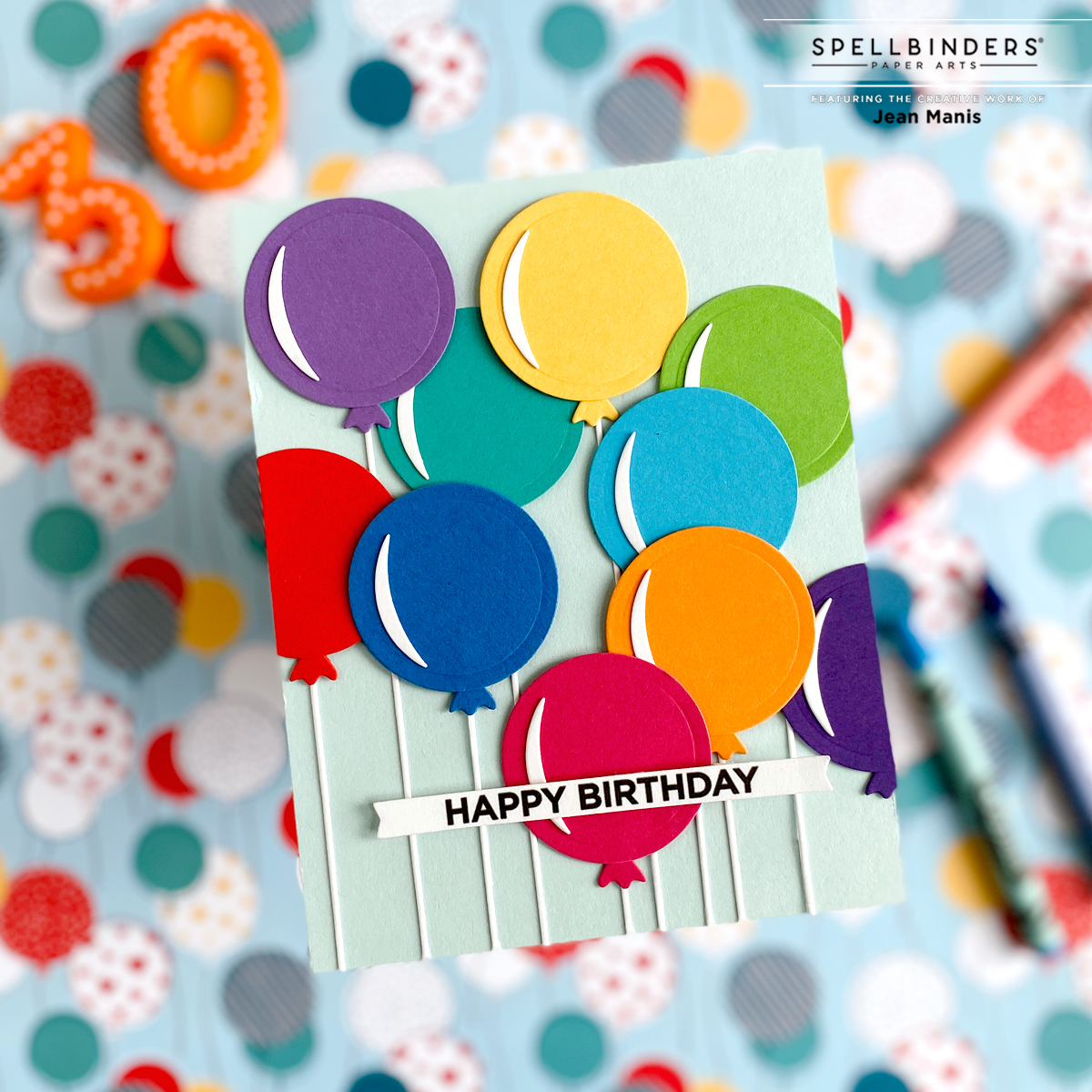
Repetition establishes a visual rhythm that makes the design feel cohesive and harmonious. By repeating a focal item, such as a scooter, a lighthouse, or a balloon, you create a pattern that the eye naturally follows. Use different colors for each repeated element to add interest. Arrange the elements in patterns, such as grids, rows, or clusters, to see what works best for your design.
Repetition can make the design process simpler and faster. Once you’ve decided on a shape or image to repeat, you can focus on other aspects like the color schemes and layout.
Repetition is a great technique for making the most of smaller focal items. By repeating a small die cut, and varying its colors, you can create a striking design.
Repetition is an especially useful technique when you’re unsure of what else to do. By repeating a single shape or image, you can fill space effectively, create visual interest, and ensure your card looks well-planned and artistic without complex details.

These are such fun, and you’ve given me a great template/idea for a July birthday card. Thank!
I learned this from you! You are great at doing it and you are right, it makes some simple things look fabulous!
Such great examples of the repetition design, Jean – rows or grids, you do them to perfection!!