

Taylored Expressions is bidding a fond farewell to over 200 products as we retire some of our favorite items with an amazing SALE. Choose from a variety of stamps and dies at up to 80% off retail price — but hurry, once they’re gone, they’re gone forever! Check out the graphic above to see how you can earn an even greater discount off the sale price and then visit the SALE HERE to start shopping! Additional discounts expire July 17th.
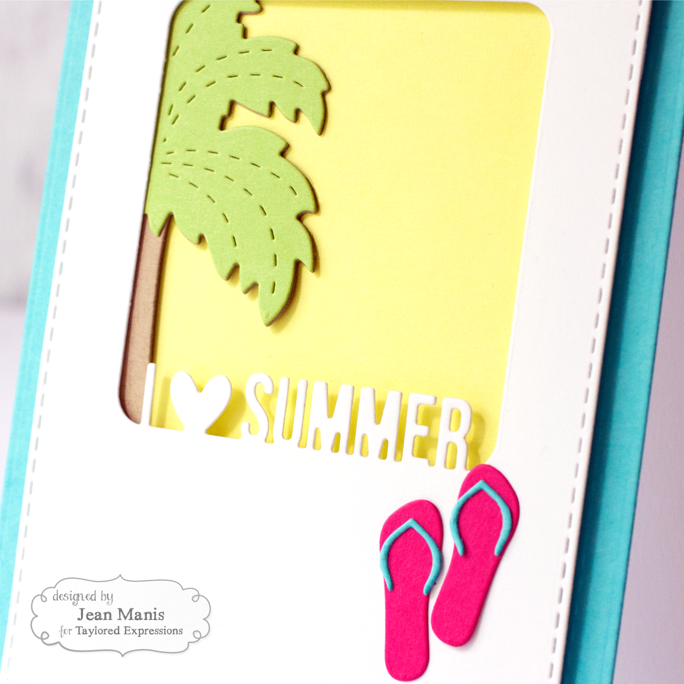
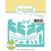
I’m sharing two CAS cards I created using one of the sale items – Pockets & Pages – Fab Frames – Summer.
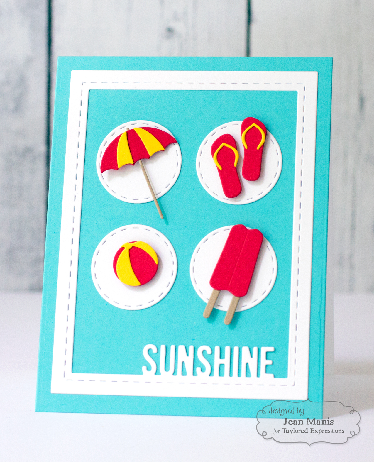
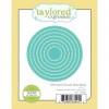
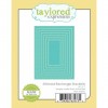
For my first card, I used one of the frames (there are three in the set) cut inside one of the Stitched Rectangle Stacklets dies to create an overlay.
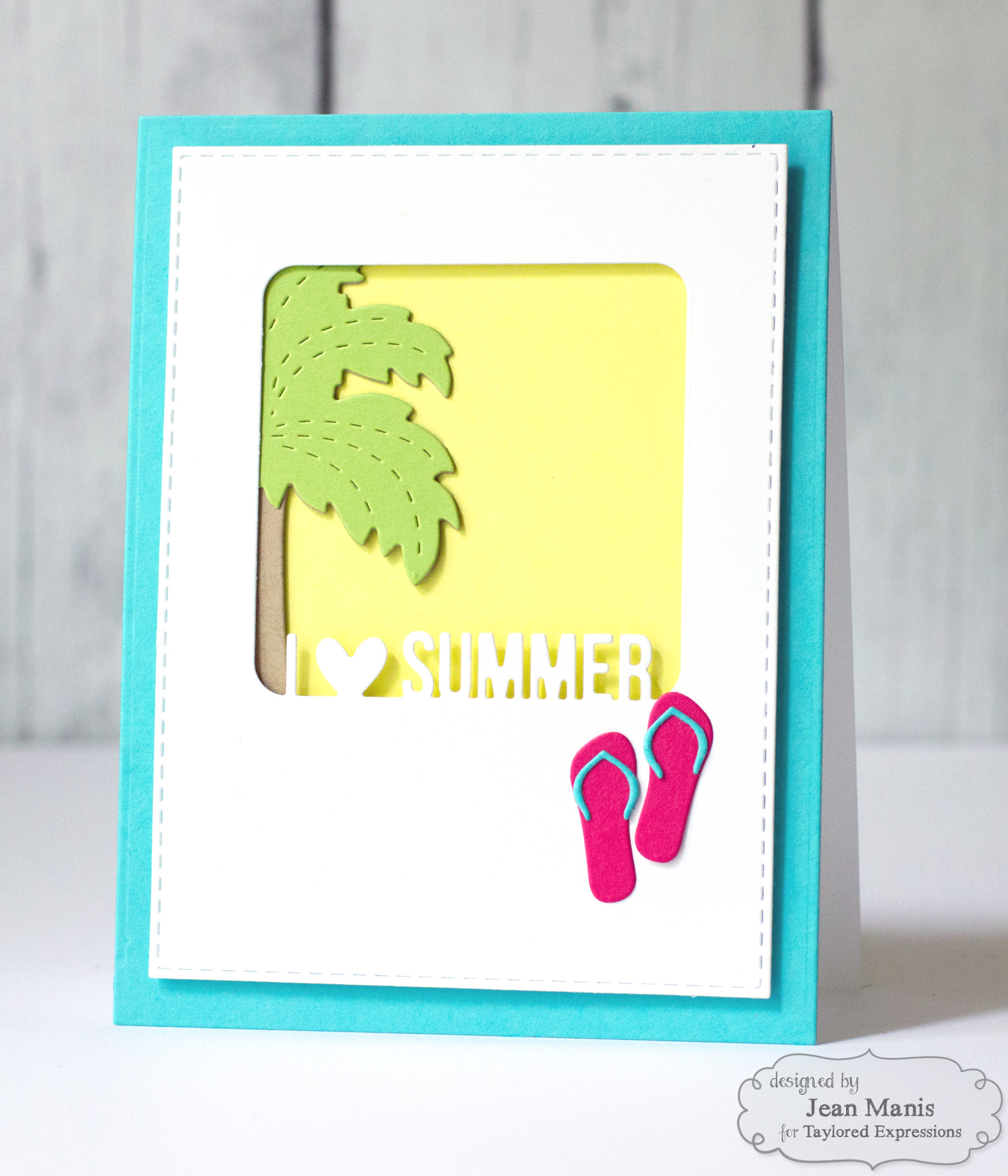
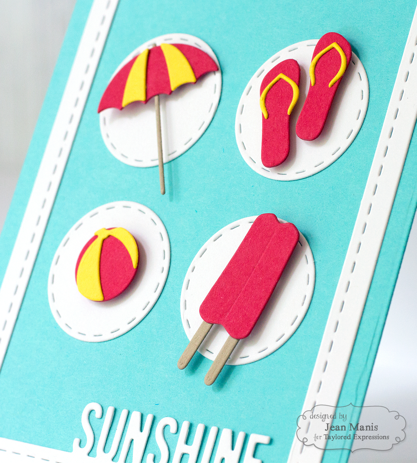
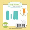
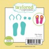
The outside edge of the Pockets & Pages – Fab Frames – Summer does not cut, so it can be placed inside a larger die. The palm was cut with the On the Line Beach Cutting Plate set and adhered directly to the cardstock background. The frame was added with foam adhesive. I couldn’t resist embellishing with the Little Bits – Flip Flops.
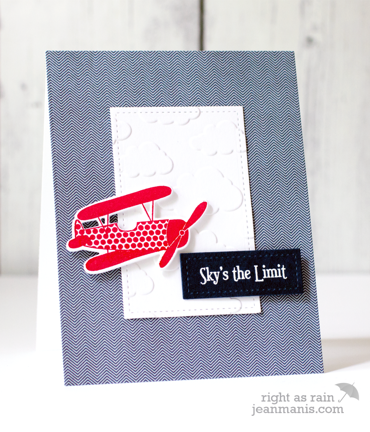
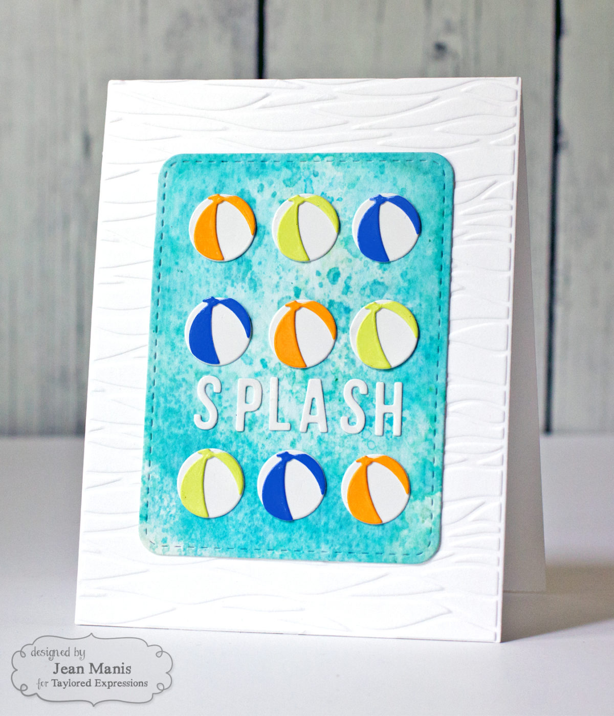
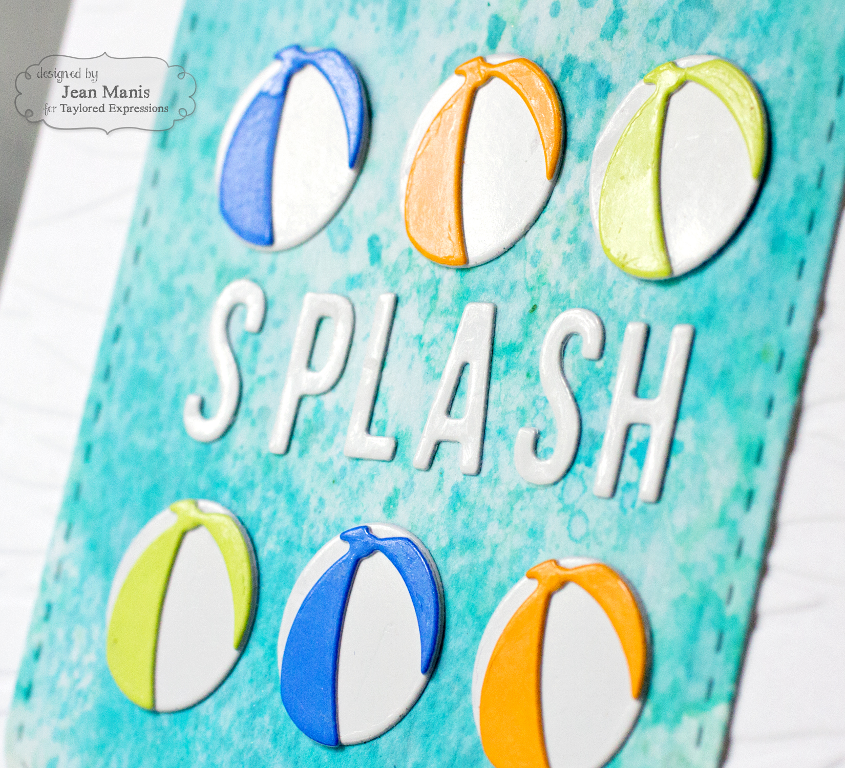
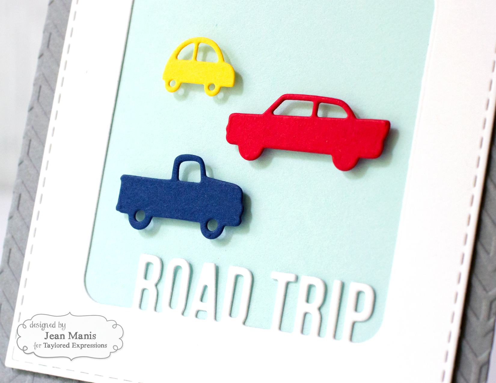
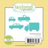
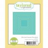
For my second card, I used a different frame in the Pockets & Pages – Fab Frames – Summer set with a die in the Stitched Square Stacklets set to create a CAS masculine card for the car lover in your family.
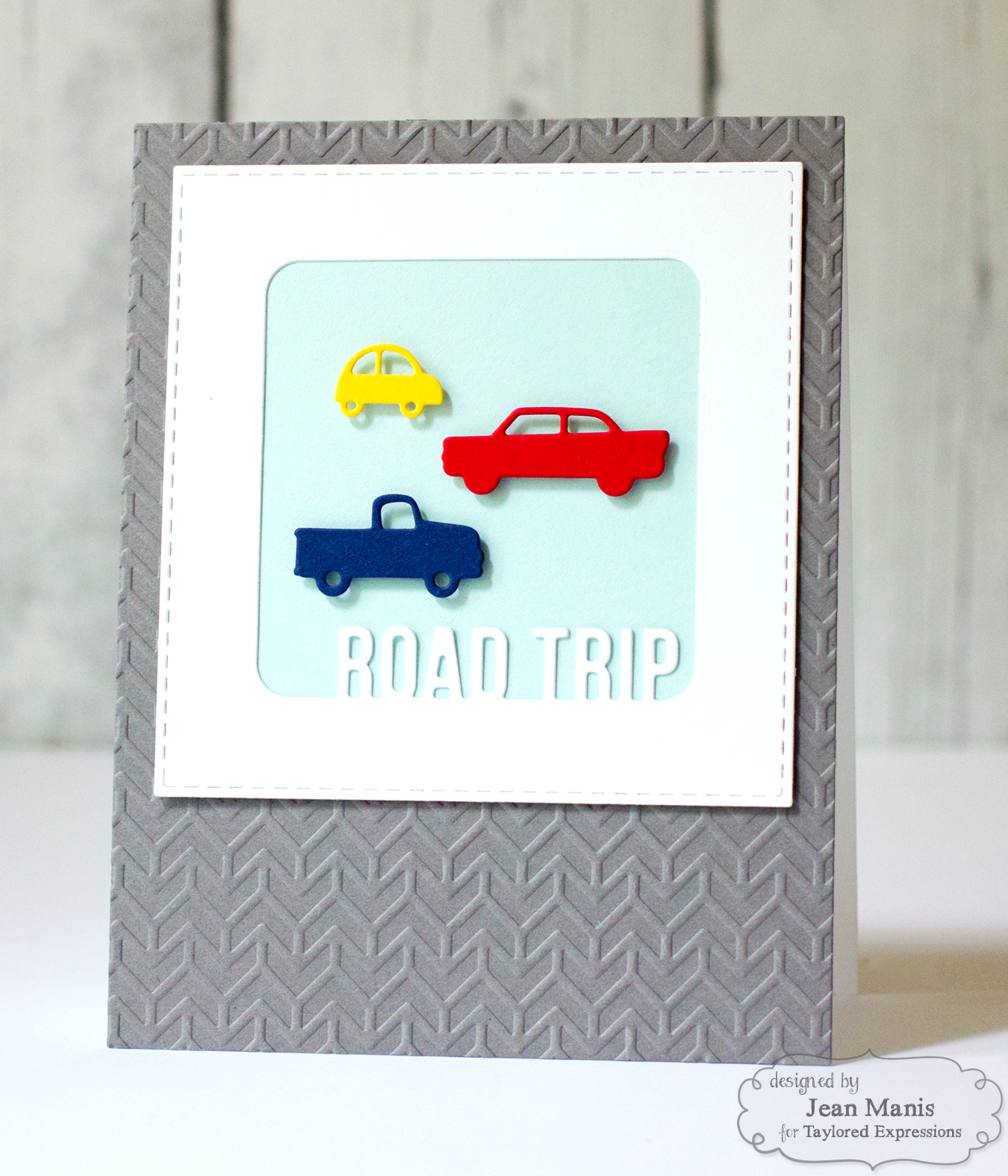
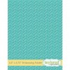
I added the frame directly to a card panel, which was dry-embossed with the Chevron embossing folder. I adhered the vehicles, cut with the Transportation set, to the frame background with foam adhesive. This card came together very quickly!
Supplies:
 |
 |
 |
 |
 |
 |
 |
 |
 |
 |
 |
 |
 |
 |
 |
 |
 |
 |
 |