Welcome! It’s time for another Pinspired Challenge. The photo is for you to interpret anyway you want. Be inspired by the colors, the style, the theme – it’s up to you!
Kiwi Lane is offering the winner of this challenge a $25 gift certificate to their online store.
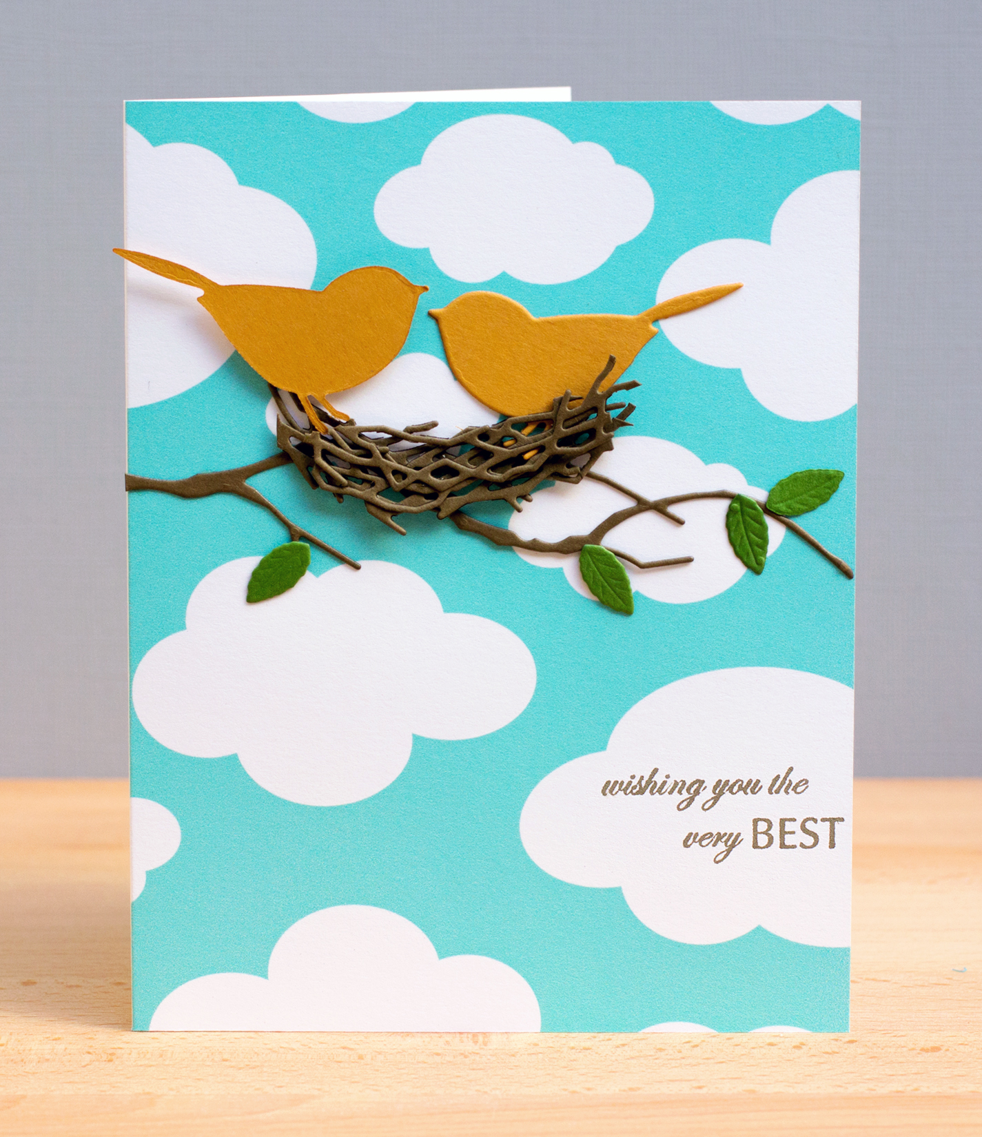
For my card, I was inspired by the theme and the colors! I created the birds’ nest out of cut pieces of the Grapevine Wreath die, which I glued together in layers. I’d love to take credit for such a clever idea, but I found the idea on the blog of Pam Sparks. If you haven’t visited her site or seen her work before, you’re in for a treat!
Now, it’s your turn. Head on over to the Pinspired Challenges blog to see the creations from the rest of the “Pin Heads” and find out the details for playing along. Three runner ups will be chosen and win a “Pin Pal” badge for their blog. A winner, who will also be chosen by the “Pin Heads,” will win a “Pin Perfect” badge for their blog along with the prize from Kiwi Lane. We can’t wait to see your creations!