Halloween “BOO”

Today, I’m sharing another Halloween card, which I created with products I already have in my stash. This is a new idea for me – to first see what I’ve already got before buying more!

Halloween-BOO

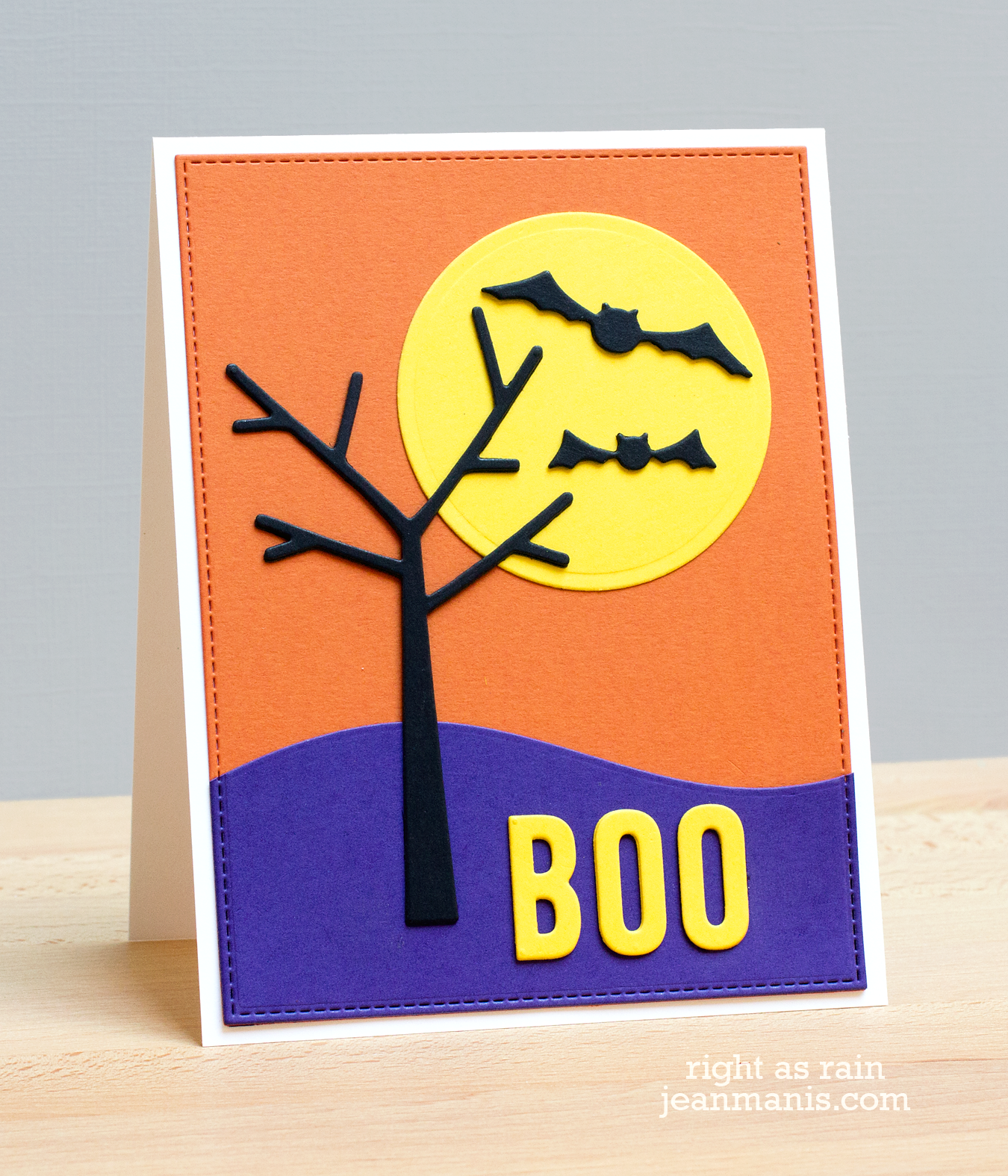
I’m mixing dies from a number of different companies. The tree is from Paper Smooches. I plan to use it again for a fall-themed card. The hill die is also from Paper Smooches. The bats are from a now-retired Memory Box set. The moon was created with a Spellbinders circle die.

I considered stamping a sentiment, but in the end, I decided to use the Lawn Fawn alphabet. The tree, bats, and letters were all die cut twice and adhered together for extra depth.

Supplies:

Stretch Your Stamps 2: CASE of Jennifer McGuire’s card

I was away for a week and I’m now catching up with the Online Card Classes Stretch Your Stamps 2 homework. I’m sharing the first card I’ve made from the class, a CASE of one created by Jennifer McGuire.

DayTwo

I made a few changes to Jennifer’s amazing design given my supplies. The Hero Arts damask background stamp is intended to be used for a portrait, rather than landscape, card (the pattern isn’t symmetrical in this orientation), but I don’t own the Tim Holtz stamp she used and I wanted to get going on the card. 🙂 I used silver ink whereas Jennifer used a gorgeous combination of Perfect Pearls.

For this card, I followed Jennifer’s instructions to apply VersaMark to the die cut sentiment and heat emboss it will clear powder. Jennifer did the process three times; I stopped after two. I will definitely use that technique in the future as it gives the die cut extra depth and great shine.

Supplies: Encore silver ink; Stampin’ Up black cardstock

Let’s Go Sailing

I’ve had the pieces for this card sitting on my worktable ever since starting the In Detail post on die-cut card making sets. As I mentioned in that post, I’ve been using the Blueprints 13 stitched rectangle die a lot!

AHOYdiecut

I dry embossed Bazzill cardstock with the Memory Box Wave stencil and cut it with the stitched rectangle. I played around with a variety of colors for the boat, the letters, the banner, the sails and the sailboat flag. It took longer than you would imagine to evaluate colors for the hull, letters, a sails, …. before settling on this combination!

I’m entering this card in the Card Concept “Use A Nautical Theme” challenge. My style is Clean and Graphic.

Speaking of die cuts, there’s still time to enter The Cutting Edge Guest Designer Challenge! Head on over for details.

Supplies:

You Anchor Me

Kristie Goulet of the Stamp Nation team regularly posts about paper crafting trends sharing tips, tutorials and projects! Kristie wrote about the nautical trend last year, when it was really at its high point. As a member, I can access those past articles. Even if the trend has cooled somewhat, I still enjoy making nautical-themed cards, especially in the summer.

AnchorWornLipstick

To create the coral striped background, I inked the Impression Obsession Thick Stripes background stamp with Distress Ink and misted it until the ink pooled. The anchor is cut from a brushed gold cardstock.

AnchorMintBlue
As long as I was making one card, I decided to make another with a little variation! I heat embossed the Impression Obsession background stamp with gold embossing powder. The anchor is cut from a gold foil cardstock.

I’m also entering the second card in the Card Concept “Use A Nautical Theme” challenge. My style is Clean and Graphic.

Supplies:

OCC Watercolor Day 3

I’m sharing a card created with the technique shown by Jennifer Rzasa in today’s Online Card Classes Watercolor for Card Makers lesson. The idea is to ink your stamp and mist with water before stamping for a watercolor effect.

DayThreeStamping

I worked on this for most of the morning (read, tore my hair out) trying Memento dye ink pads, as she suggested, and finally switching to Distress Ink pads. I walked away from this more than once when I wasn’t getting the results I wanted! I had the best results stamping onto the Ranger Watercolor paper. I tried Neenah Solar White but the ink looked blah on it.

I die cut the sentiment four times, the last time in watercolor paper I colored with the Worn Lipstick Distress Ink pad to match to the flowers.

Supplies: