Summer of Creative Chemistry Week 5

This week, the challenge at Summer of Creative Chemistry with Tim Holtz at Online Card Classes is to create a project using 3 or more Distress Paints.

SummerOfCreativeChemistry-Participant

For my tag’s background, I used the Eroded Metallics technique.

Tim Holtz Summer of Creative Chemistry Week 5

It took me several tries to feel like I was really getting the technique. I used Silver Distress Paint, although the Copper would have given a more patina look. The Copper is on my list to purchase. I was running out of Silver paint, otherwise I would have kept making tags using the technique. The water portion of the globe was cut from an earlier attempt at the technique. I figured I would find a way to salvage the tags! I used Distress Paints to paint manila cardstock for the land portions on the globe and for the globe stand.

Sunny Summer Days – TE Share Joy Challenge #42

I’m playing along with Taylored Expressions Share Joy Challenge #42.

TE Share Joy Challenge #42

I used the sketch to create a card celebrating summer. I was indirectly influenced by the inspiration photo. The ice cream cone made me think of popsicles, which made me think of flip flops, …).

TE Share Joy Challenge #42

The Little Bits adhered to the die-cut circles, do the heavy lifting here, while the Picture Perfect – Sunny Days frame adds a sentiment and ties the card together.

TE Share Joy Challenge #42

Be sure to head over to the Share Joy Challenge Blog to see more inspiration and to link up your entry!

Supplies:

Splash! – colourQ challenge #348

I’m playing along with colourQ challenge #348 with a CAS summer-themed card.

CQC348

I thought about this combination of colors for a bit and kept trying to figure out which color should have the most emphasis and which the least. In the end, I decided to give the colors more or less the same amount of emphasis and employed my design friend – repetition.

colourQ challenge #348

I colored Ranger Glossy Cardstock with Distress Inks to cut with the Little Bits – Beach Ball die. I cut the base of the balls and the Mini Caps Alpha & #’s from uncolored Glossy Cardstock. I like how the glossy cardstock emulates the plastic of blow-up beach balls. I colored the background using Loll Thompson’s “splash” watercolor technique using Tumbled Glass Distress Ink- her video is here. I had “splash” on the brain, since that’s what I used for the sentiment!

colourQ challenge #348

Supplies: Tim Holtz wave embossing folder, Taylored Expressions Pockets & Pages – Stitched Essentials, TE Little Bits – Beach Ball, TE Mini Caps Alpha & #’s

Summer of Creative Chemistry Week 4

This week the challenge at Summer of Creative Chemistry with Tim Holtz over at Online Card Classes is to create a tag, card, or other project using ARCHIVAL INK.

SummerOfCreativeChemistry-Participant

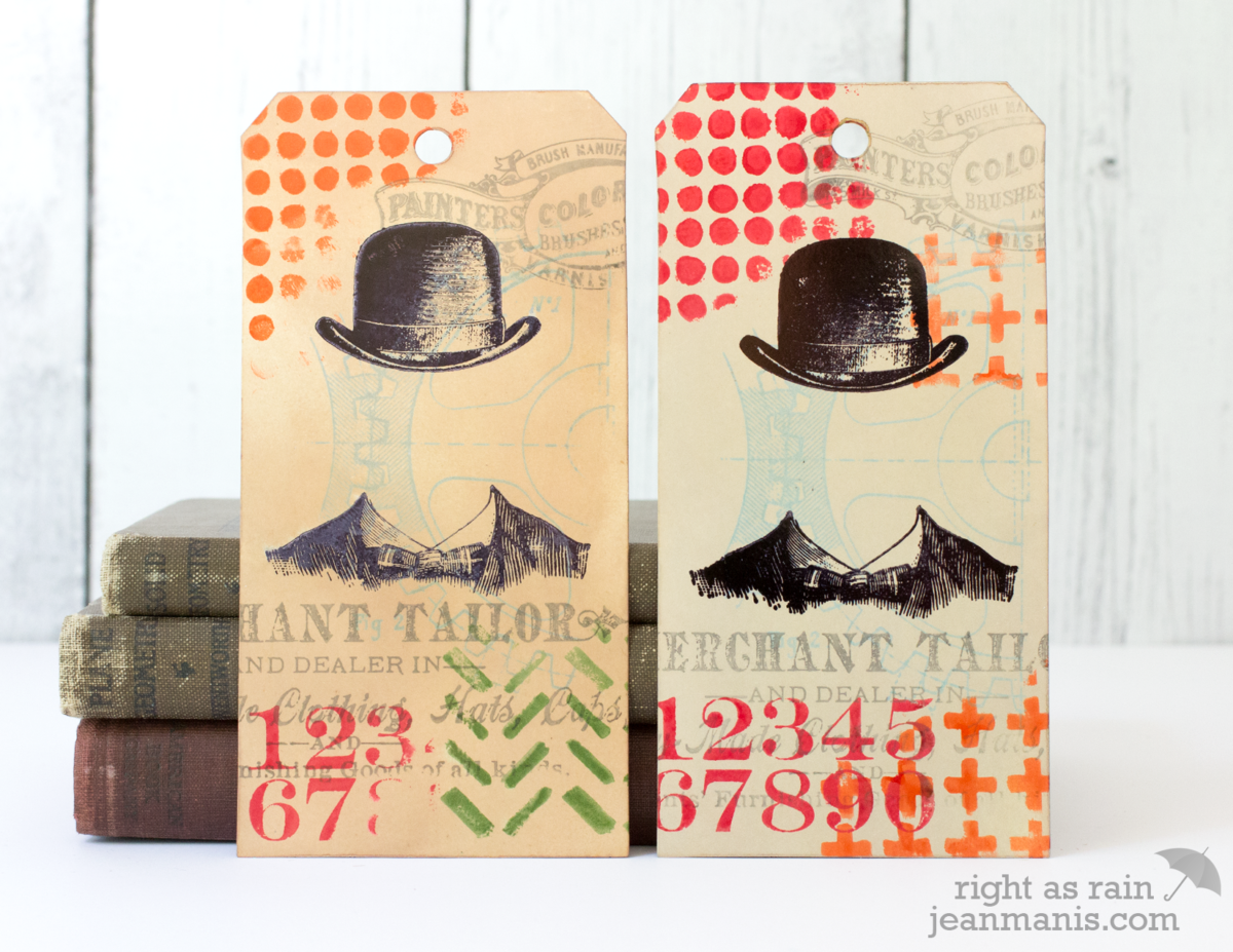
For the challenge, I created tags using the Dapper and Mixed Media 2 stamp sets with the Archival Resist technique. I stamped glossy cardstock with Archival inks and then applied Distress Inks to the background. Because of the difference in the properties of the two inks, the images stamped with Archival Ink resist the Distress Inks.

 Summer of Creative Chemistry with Tim Holtz

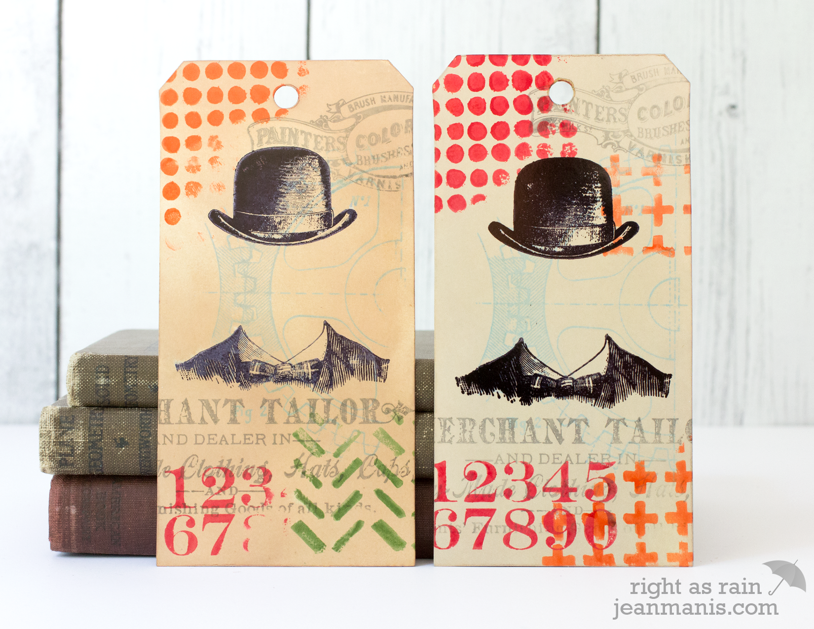
For the tag on the left, I stamped all of the images (including the hat and shoulders) before applying the Distress Inks. For the tag on the right, I stamped the hat/shoulders image after I colored the tag background, so it’s more prominent. I made at least five of these tags trying different images and colors.

I also revisited the Distress Powder Resist Technique from Day Seven of Creative Chemistry 101. I liked the tag and the technique but wasn’t entirely happy with the design.

Summer of Creative Chemistry with Tim Holtz

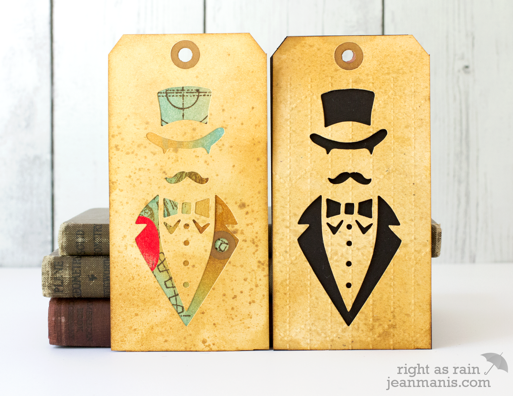
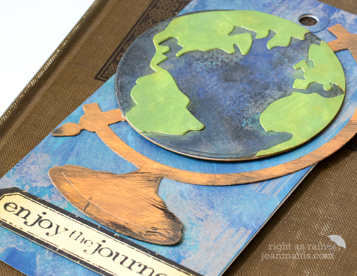
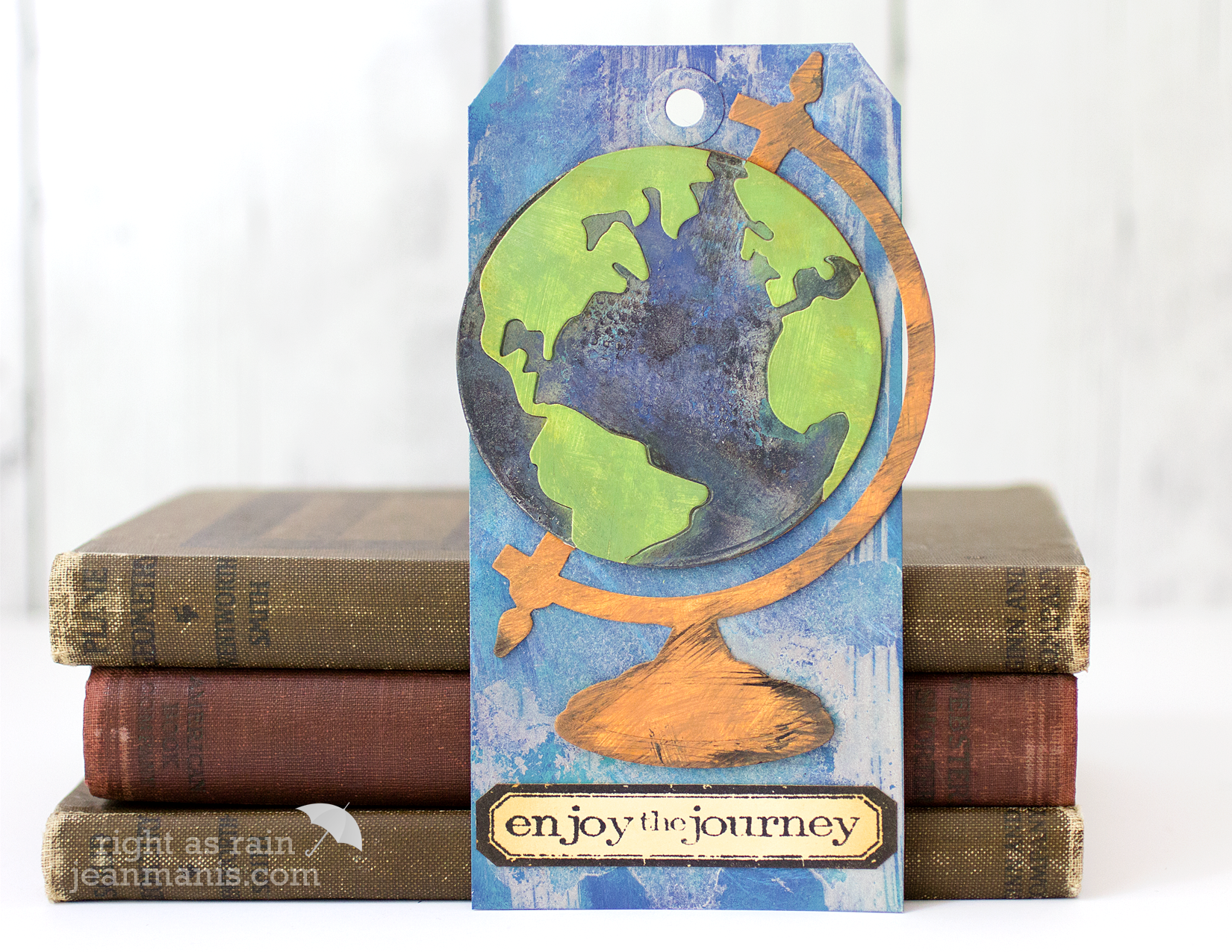
However, once I started creating tags similar to Tim’s 12 Tags of 2016 – June, using the Sizzix Dapper die, I decided to cut up the tag I had made and used it to back the negative cut that the Sizzix Dapper Die creates (left).

I also cut another tag with the Dapper die, dry-embossed it with the Tailored Embossing Folder and backed it with a black tag (right).

Finally, I revisited last week’s challenge to create with Perfect Pearls and Distress Inks and Stains.

Tim Holtz Creative Chemistry Week 4

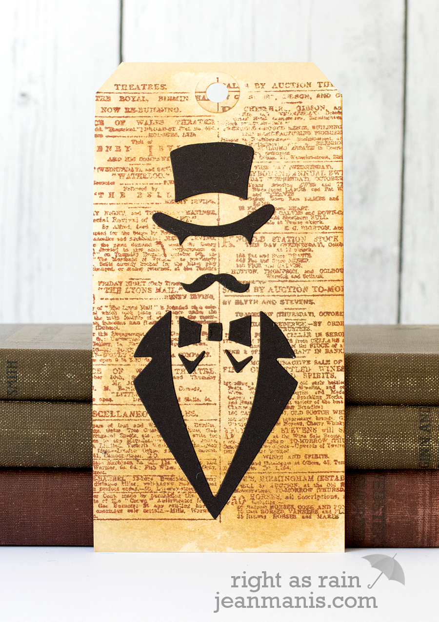
I used Heirloom Gold Perfect Pearls on a tag stamped with the Distress Ink Newsprint background and glued on the positive pieces from the Sizzix Dapper Die.

Mixed media is fun as long as you allow yourself to experiment!

Supplies: Sizzix Dapper Die

Living the Salt Life

I’m constantly on the lookout for nautical-themed stamps and dies. Today I’m sharing a card celebrating the “salt life” in which I’ve combined products from several different companies.

Living the Salt Life

I used two CottageCutz die sets- Pelican and Seagull – to create the seagull standing on the pilings. I colored the die-cut pieces with Distress Inks so that there would be greater variation than I would have achieved had I simply cut the pieces from colored cardstock.

The waves were created with Distress Inks and a Memory Box stencil. The sentiment is from Impression Obsession’s Nautical set.