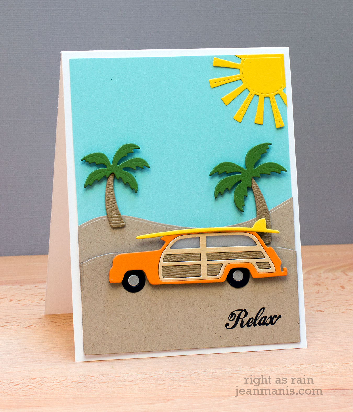
End of Summer – Relax!

Today I’m sharing a card celebrating summer – the idea of taking a break and relaxing, possibly traveling someplace with palm trees! – featuring new Impression Obsession dies, as well as other dies in my collection.
End of Summer - Relax!

I cut the Woody multiple times with a variety of cardstocks including woodgrain, birch and vellum, to provide texture and color. The sentiment is from the Taylored Expressions’ Hangin’ Out – At the Beach stamp set.

Supplies: Impression Obsession Woody with Surfboard and Palm Trees; Lawn Fawn Spring Showers; TE Build-a-Scene – Rolling Hills dies and  Hangin’ Out – At the Beach stamp set

Freshly Made Sketches #136

I’m mixing things up a bit this week and playing along with Freshly Made Sketches for the first time.

Freshly Made Sketches #136

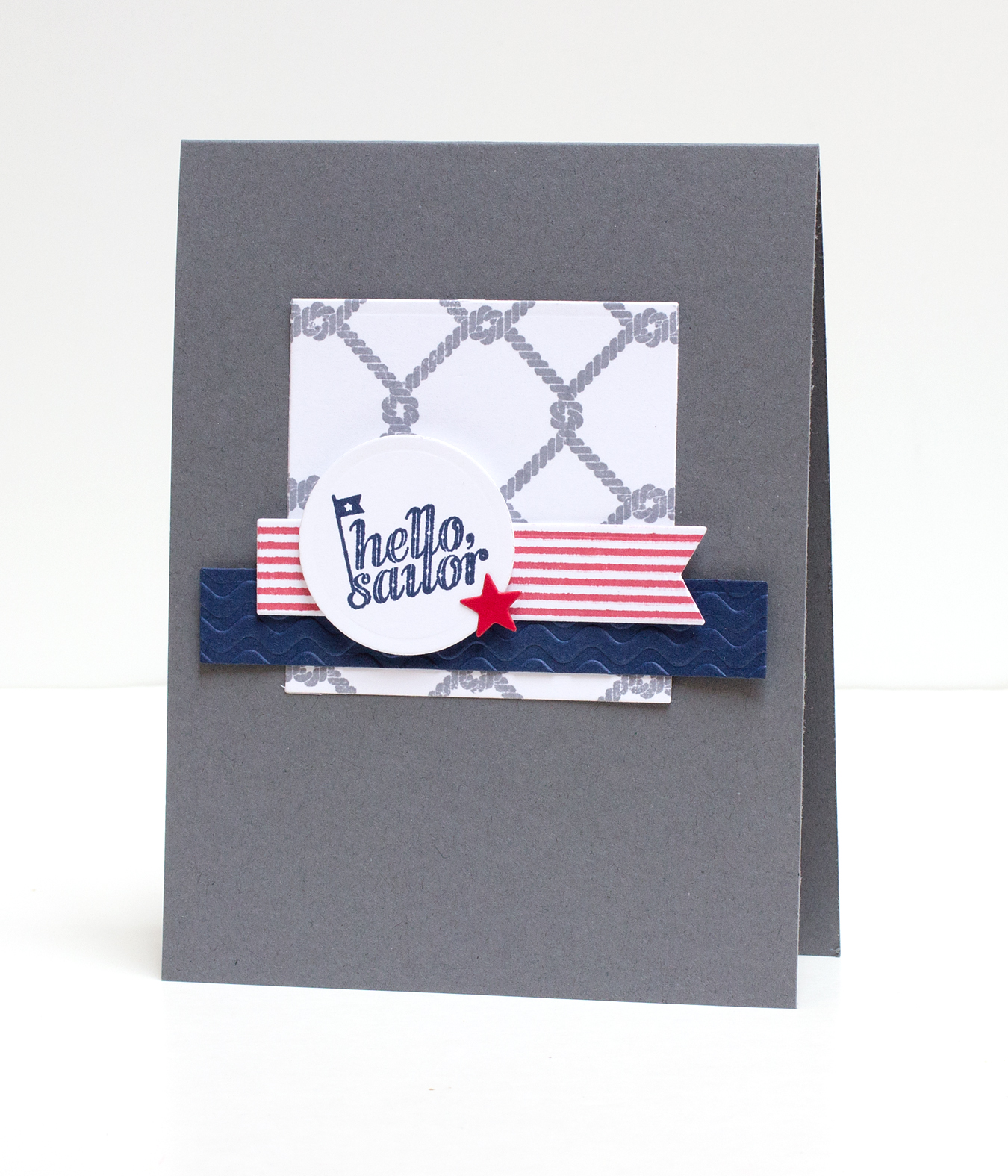
Why, yes, I am still making nautical cards! I had so much fun making them last week, I’m making more! Although I considered using patterned papers, I decided I wanted to stamp the individual pieces instead. I stamped just about everything more than once, in a variety of colors, before making my final selections. I’m sure some people can just “know” right away that they want a particular element to be a certain color, but not me! I need to see all of the different combinations.

OCC Watercolor Day 2

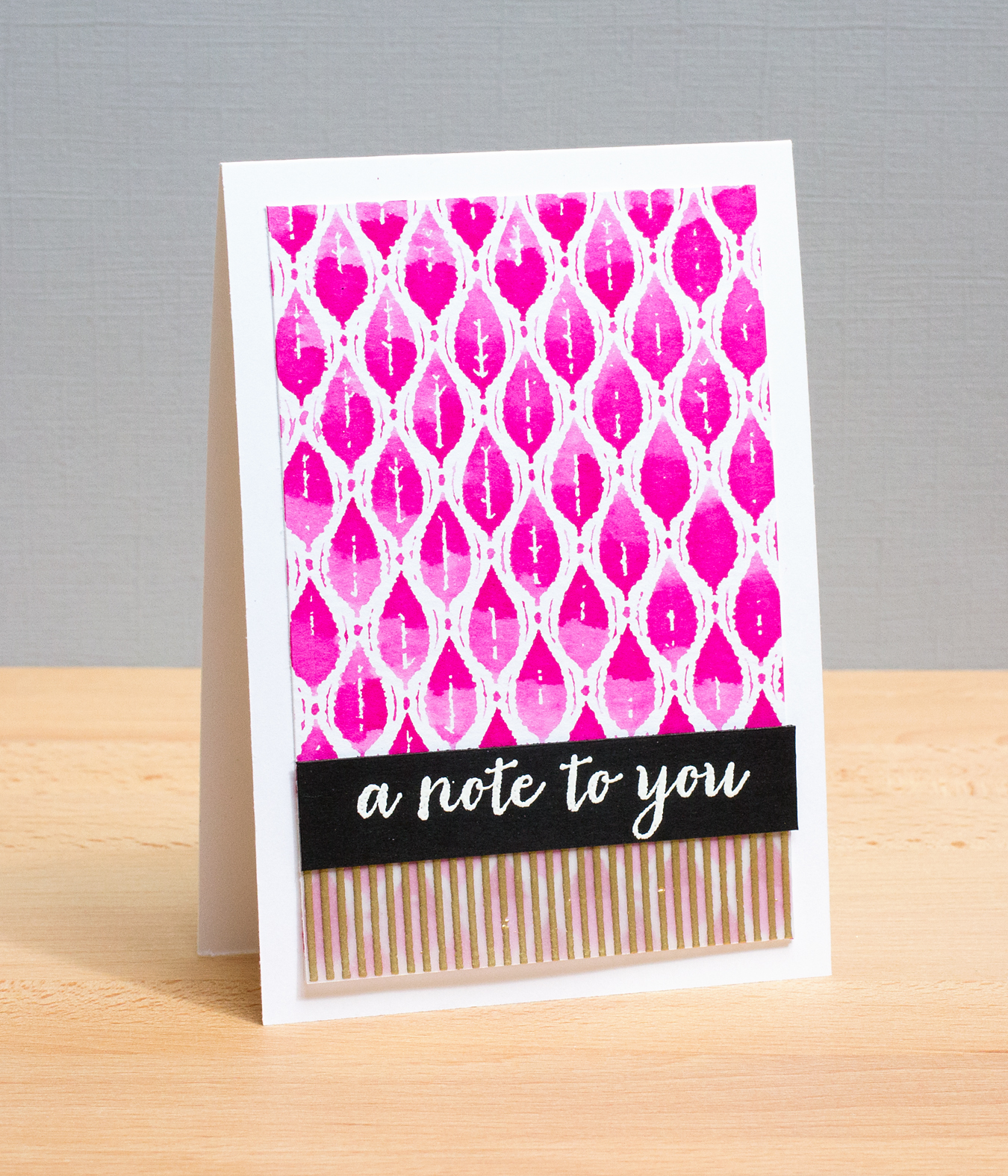
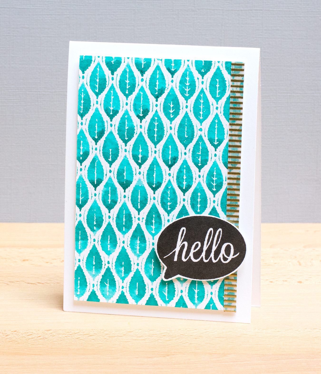
Today was another fun day in the Online Card Classes Watercolor for Card Makers class, in which we had a second day to explore watercolored backgrounds. I’m sharing two cards based on cards shown by Debby Hughes in today’s class. I’ve substituted stamps in my stash for those she used on her cards.

DayTwoRaspberry

DayTwoPeacock

Both cards use the Hero Arts Simple Leaf background stamp.  For the top card, I inked the stamp with Picked Raspberry Distress Ink, gave the stamp about ten squirts of water with a Mini Mister, and pressed Ranger watercolor paper, smooth side down, onto the stamp. For the second card, I stamped with Peacock Feathers Distress Ink using the same method. To be honest, I’ve hardly used this stamp because I got stuck on it being a leaf motif. I like the Batik-like feel it gives, stamped with this technique.

Debby is a master at adding accents to her designs, in this case, black and white with touches of gold. I stamped an Impression Obsession Thin Line background stamp with VersaMark ink on vellum and heat-embossed it with Hero Arts gold powder. I used stripes of the heat-embossed vellum on both cards for a gold accent. Both card sentiments are from Hero Arts.

Hollyhock Bouquet

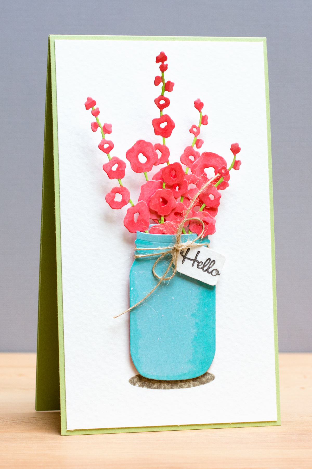
In most cases, I create cards with the end in mind, or at least a vague idea. Such was not the case with this card, which grew to be quite tall!

ImpressionObsessionHollyhocks

My inspiration for this card comes from Dina Kowal. She’s both a designer for Impression Obsession, as well as a member of their design team. She shared a card recently combining the Hollyhock and Mason Jar dies.

I cut white cardstock with the Hollyhock die several times,  and colored the flowers with Copics. I’ve never colored die cuts with Copics before, but I have to say it’s certainly easy and you can get the colors you want! I used the Mason Jar die to cut a piece of patterned paper that I colored with a Copic to add shading along the sides. I added a shadow under the mason jar with an Amuse Studios set. The sentiment comes from the Hero Arts “All Occasion Messages” set. The sentiment says “Hello Friend.” I simply cut it in two, as I find myself frequently needing a little sentiment to fit onto tiny tags (this tag was cut with a punch). The background paper is Strathmore 140lb coldpress watercolor paper. For this card, I wanted something off-white with a little bit of texture. I buy the Strathmore paper in a big pad and cut it down to size.

Supplies:

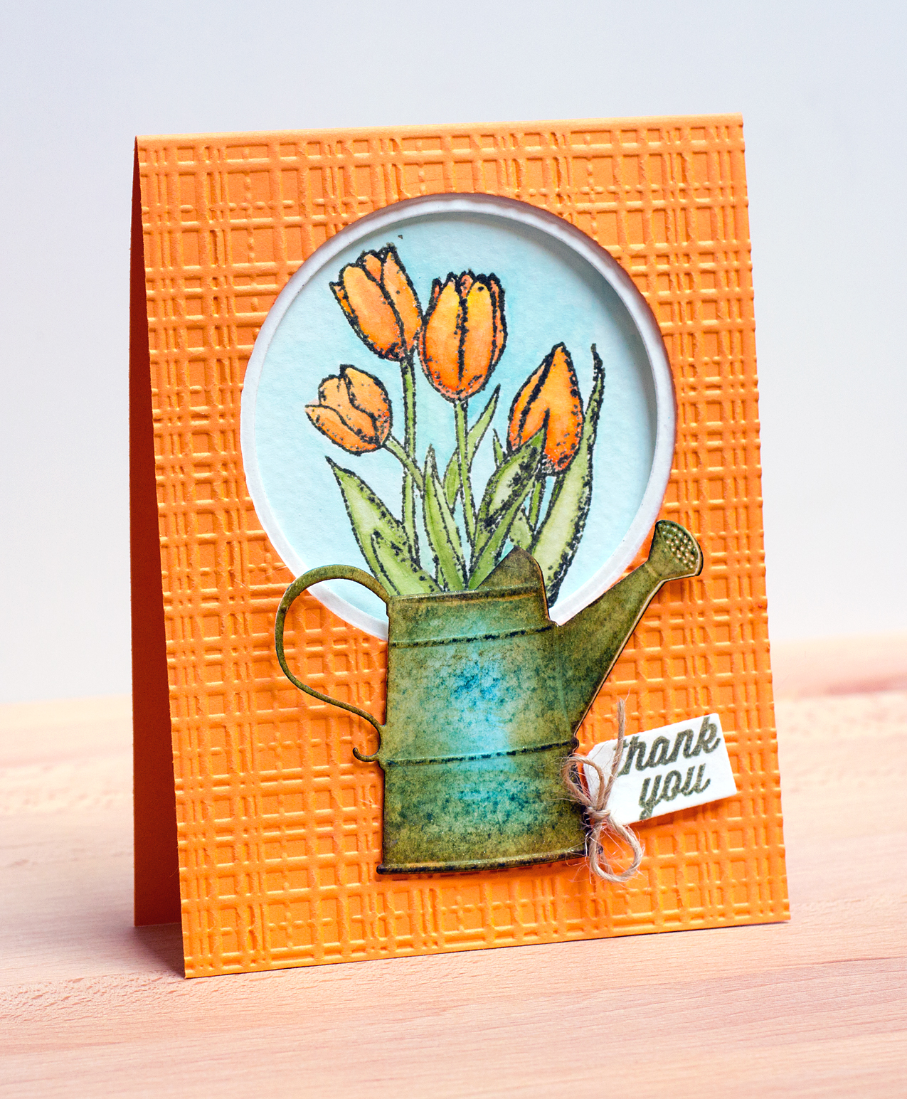
Just Cut Tulips

I’ve been watercoloring with Distress Inks a lot lately – stamped images, die cuts, whatever I can find that will take the ink.

IOTulips

You have to give a little visual leeway with this card in terms of whether the tulips are really in the watering can (that right-hand tulip leaf is sticking out!). I got to this design the long way round. At first, I planned to put the watering can, which is cut from Strathmore 140 lb cold-press watercolor paper and colored with Broken China and Vintage Photo, directly on top of the stamped and colored tulips. But when I watercolored the cast shadow, it was a mess. (I’ve subsequently practiced painting cast shadow bases!)

The dry-embossed card base, with the circle cutout, is my design fix for the poorly painted cast shadow. By the way, the Bazzill 100 lb. cardstock is becoming my go-to supply – even dry-embossed and holding the watercolor panels, it’s standing strong.

Supplies: